Assignment 1
Generative Art Examples:
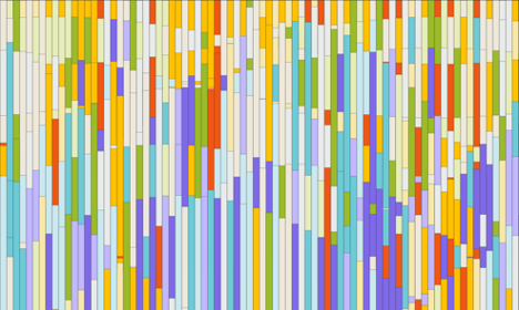
Lucia, Anna. 2022. Art For Walls in Public Spaces. https://www.electricartefacts.art/news/february-generative-art-picks-on-fxhash-nft-highlights (September 12, 2022).
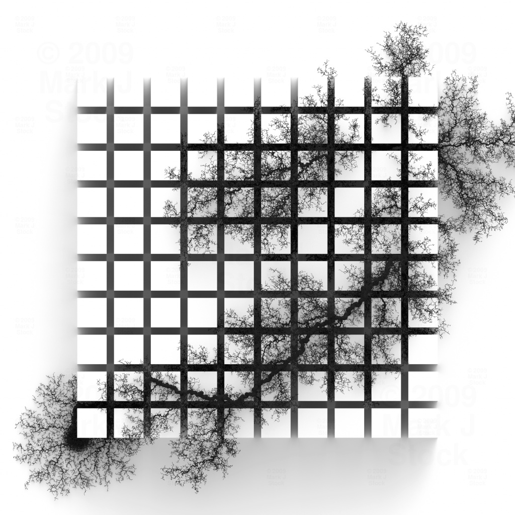
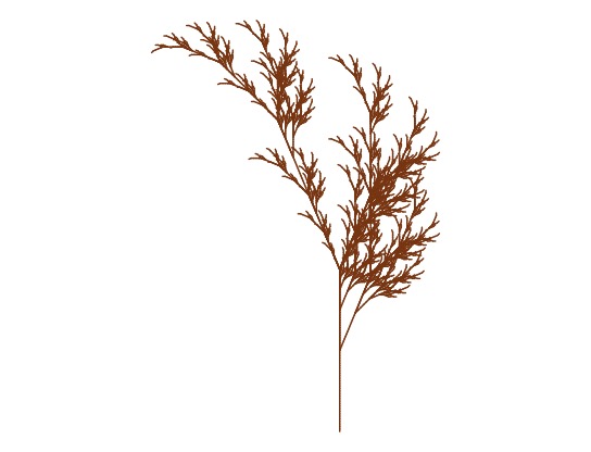
Stock, Mark. 2009. Sprawl. http://markjstock.com/#/dendrite/ (September 12, 2022).
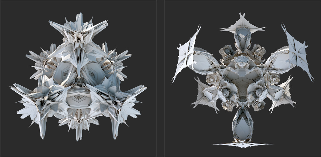
Hansmeyer, Michael. 2008. Platonic Solids. https://www.evolo.us/computational-subdivided-platonic-solids-michael-hansmeyer/ (September 12, 2022).
Chart Critique:
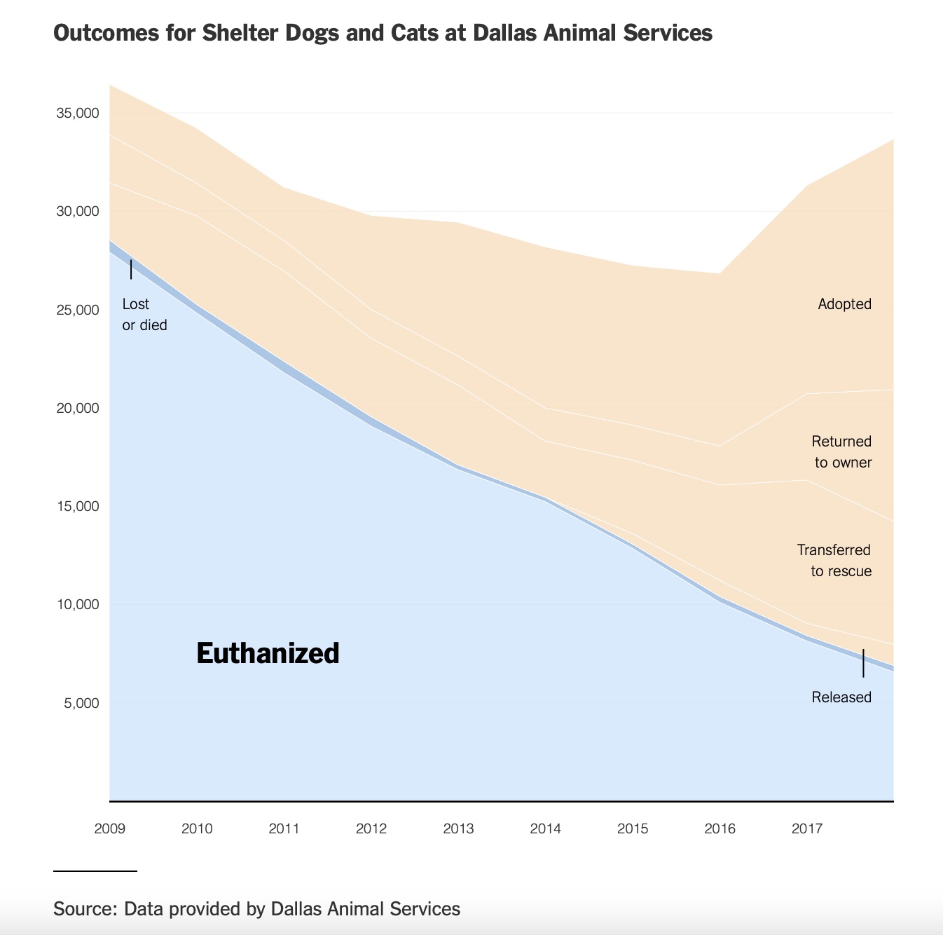
Parlapiano, Alicia. 2019. “Why Euthanasia Rates at Animal Shelters Have Plummeted.” The New York Times. https://www.nytimes.com/2019/09/03/upshot/why-euthanasia-rates-at-animal-shelters-have-plummeted.html (September 12, 2022).
Although this graph depicts better outcomes for shelter animals in Dallas, its fails to adequately show the differences in the outcomes. The lines for the lost or died and released outcomes of shelter animals are so faint that they could be easily missed or confused for another outcome. Their labels fail to clearly point out which line they are referring to. The faint outcome lines make it difficult to differentiate between the negative outcomes in blue and more positive outcomes in orange. I think this graph pays too much attention to the steady decline of euthanasia rates that it takes focus away from the positive outcomes. I would argue that this graph could have depicted its data better by getting rid of the orange and blue color blocks and highligting each outcome variable with a clearly marked and color coded line.